United Parcel Service
Driving the future without limits.
brand
identity
For this project, I created a future-focused rebrand while preserving UPS’s legacy and brand equity.
United Parcel Service (UPS) is a global logistics company that began as a small messenger service in Seattle, built on the simple promise of reliability and trust. Over time, UPS has grown into one of the world’s largest delivery networks. Rooted in a legacy of dependability, the brand continues to connect businesses and communities across the globe while evolving to meet the future of commerce.
When I began this rebranding project, the main challenge was honoring more than a century of UPS’s legacy while positioning the company for the future. I started out by researching the brand’s history, brand equity, and competitors to gain a better understanding of the industry.
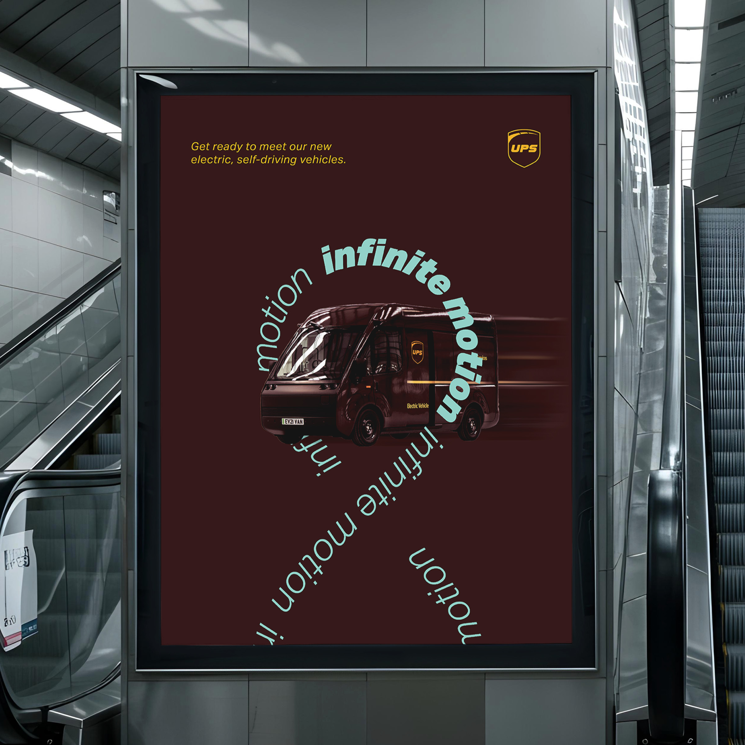
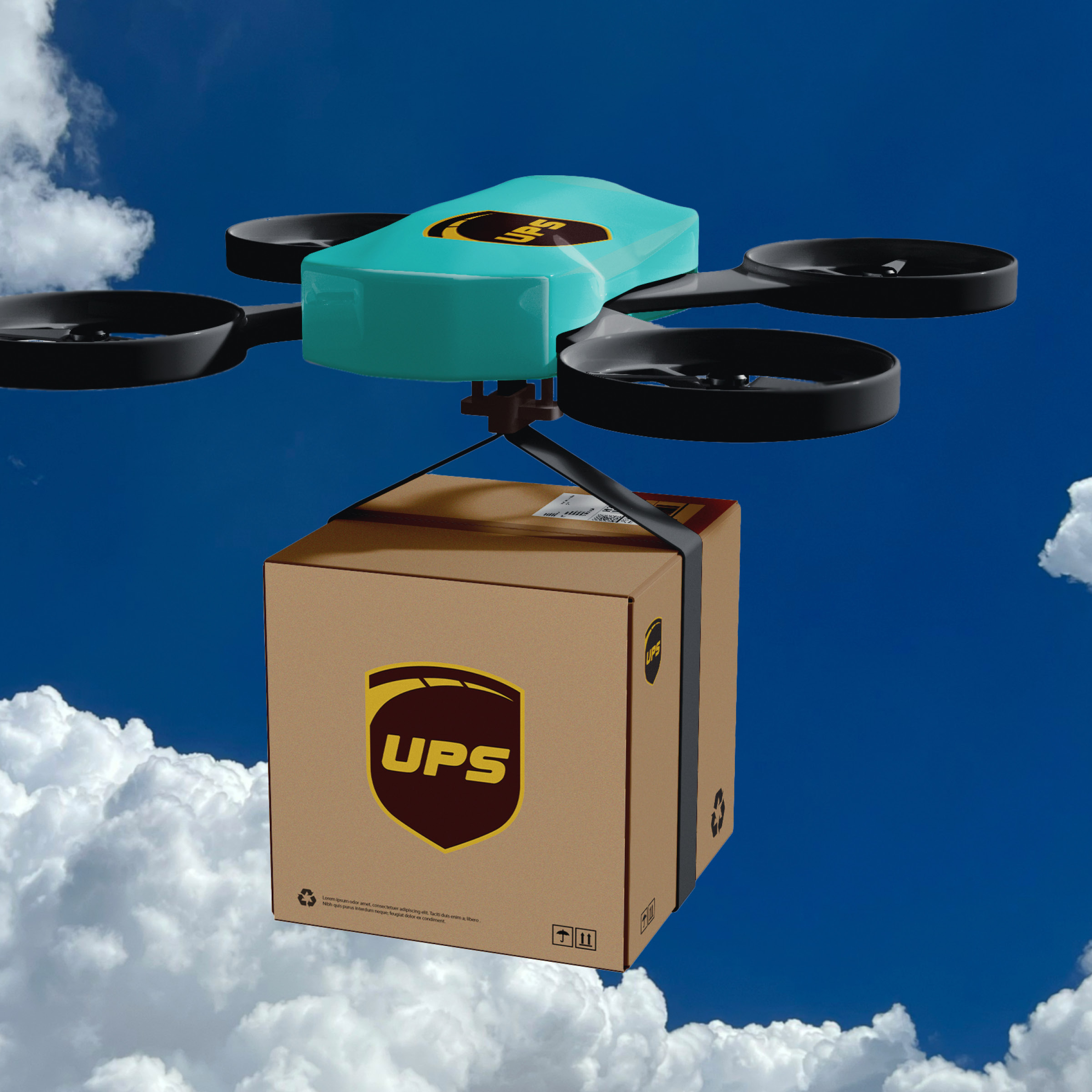
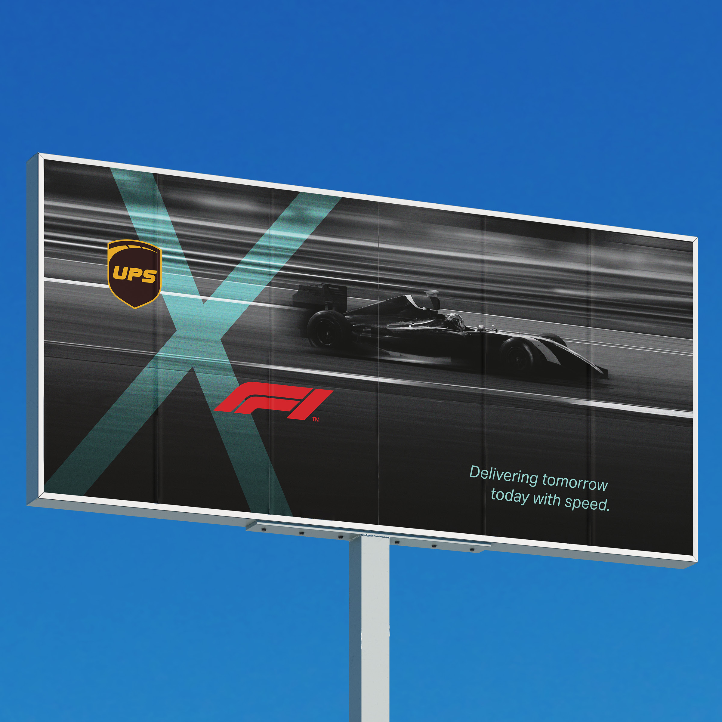
From this research, I came up with three brand attributes to guide the redesign: Energetic, Boundless, and Futuristic. Energetic reinforces UPS as a company driven by speed and efficiency; Boundless highlights its global reach and ability to deliver anywhere; and Futuristic reflects the brand’s forward momentum toward AI-driven logistics, self-driving vehicles, and sustainable solutions.
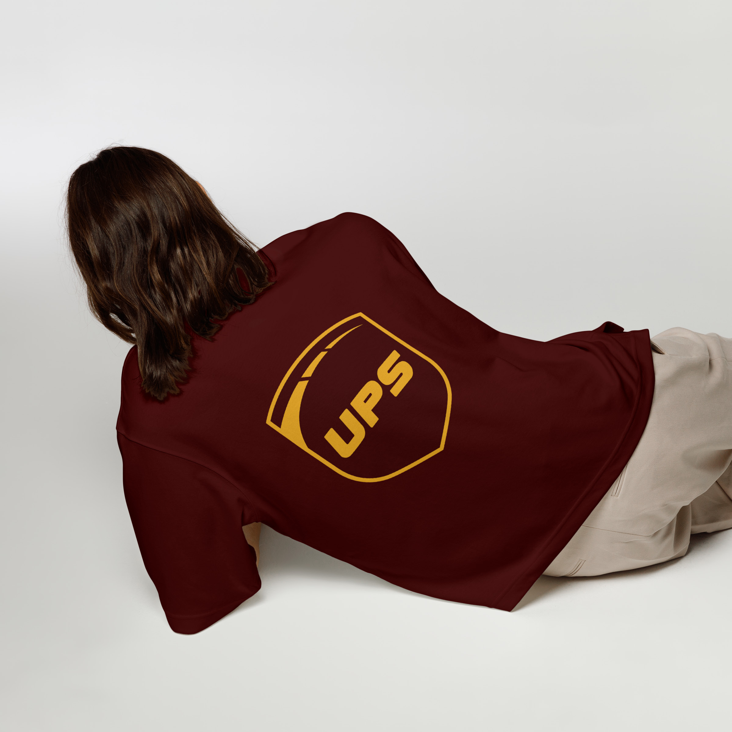
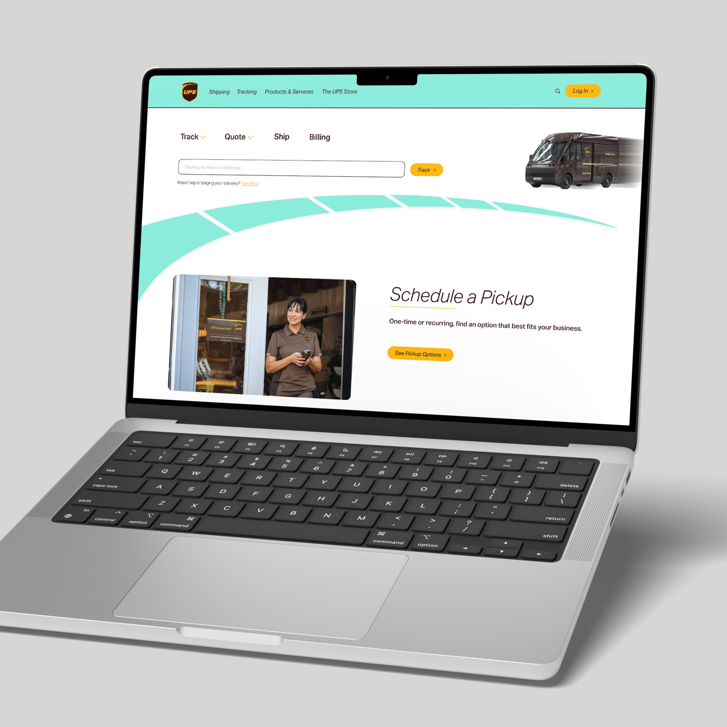
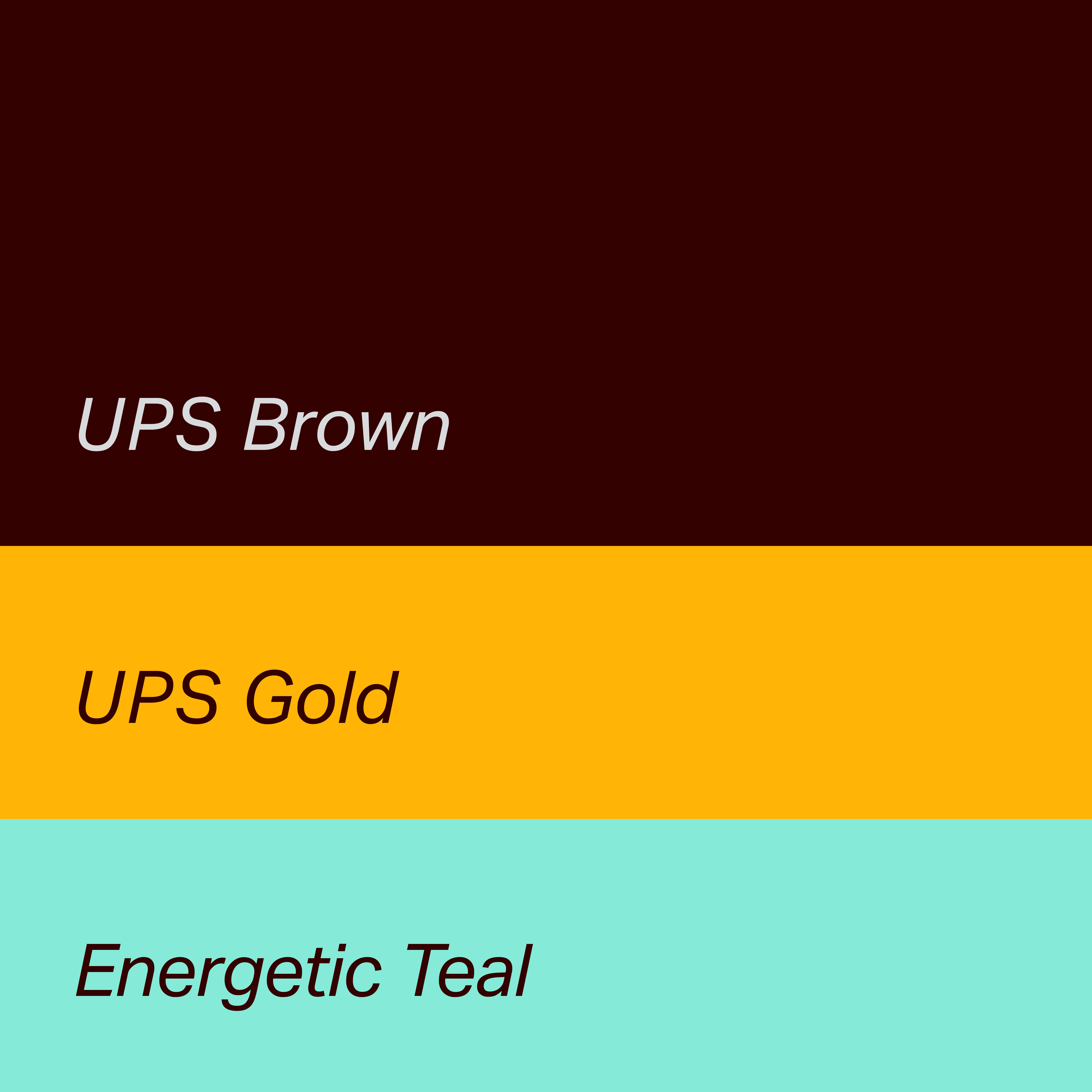
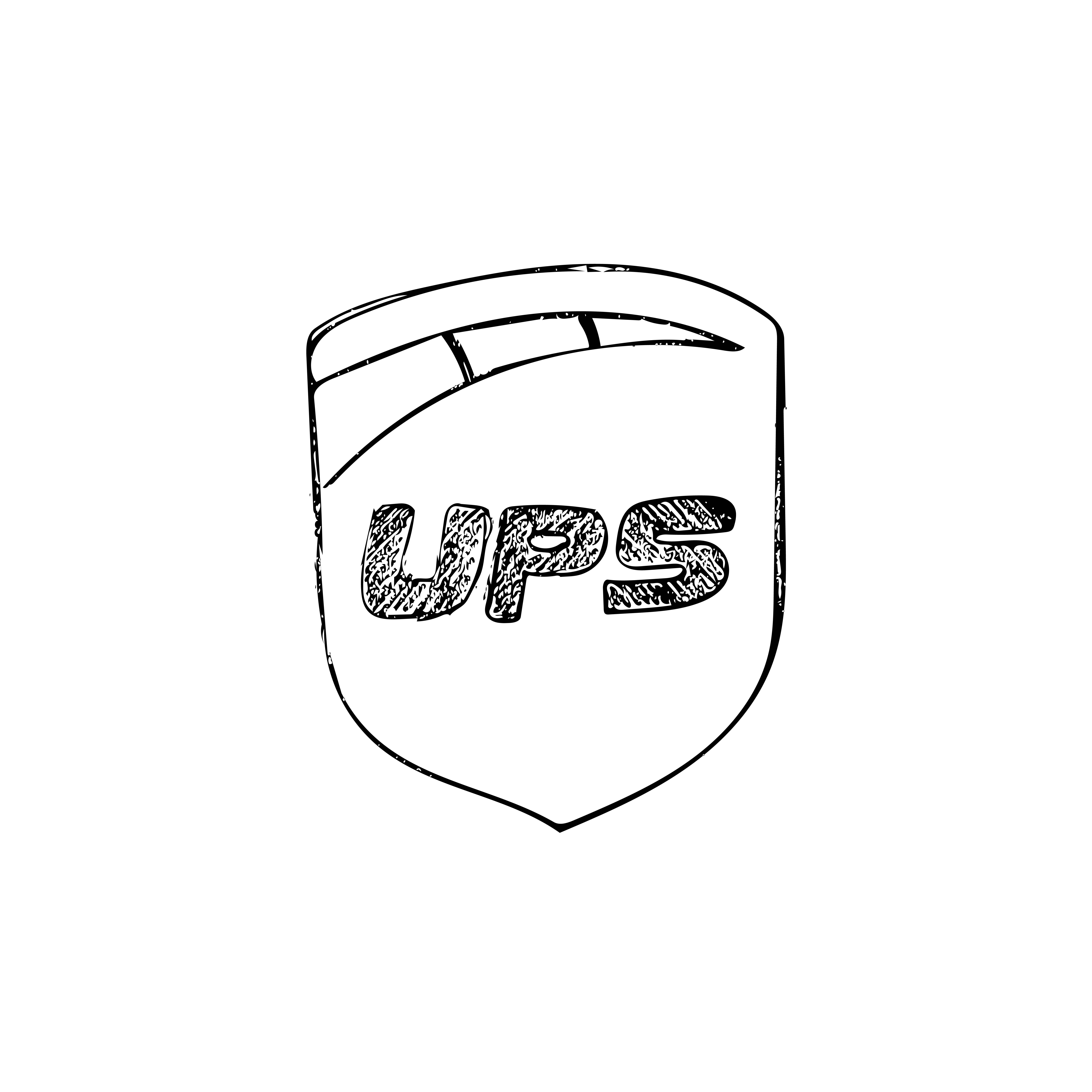
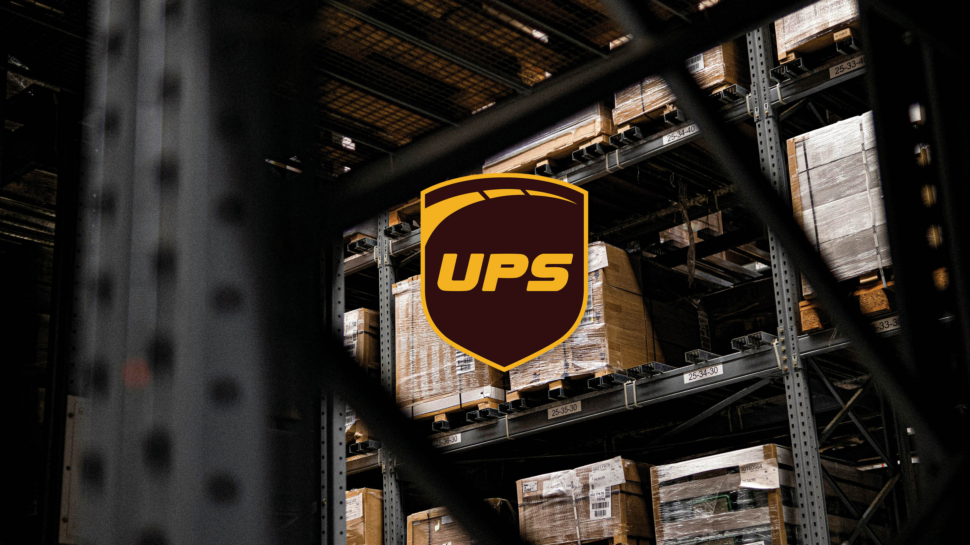
The updated visual identity keeps the iconic gold and brown UPS shield while refining the typography and arch for a more modern look. The color palette was expanded with an accent color, Energetic Teal, and an “Infinite Motion Loop” graphic was introduced to symbolize speed, movement, and UPS’s global customer reach.
Overall, this project taught me the importance of research-driven design. It highlighted how meaningful brand identity evolution depends on respecting historically significant elements while thoughtfully positioning them for the future.